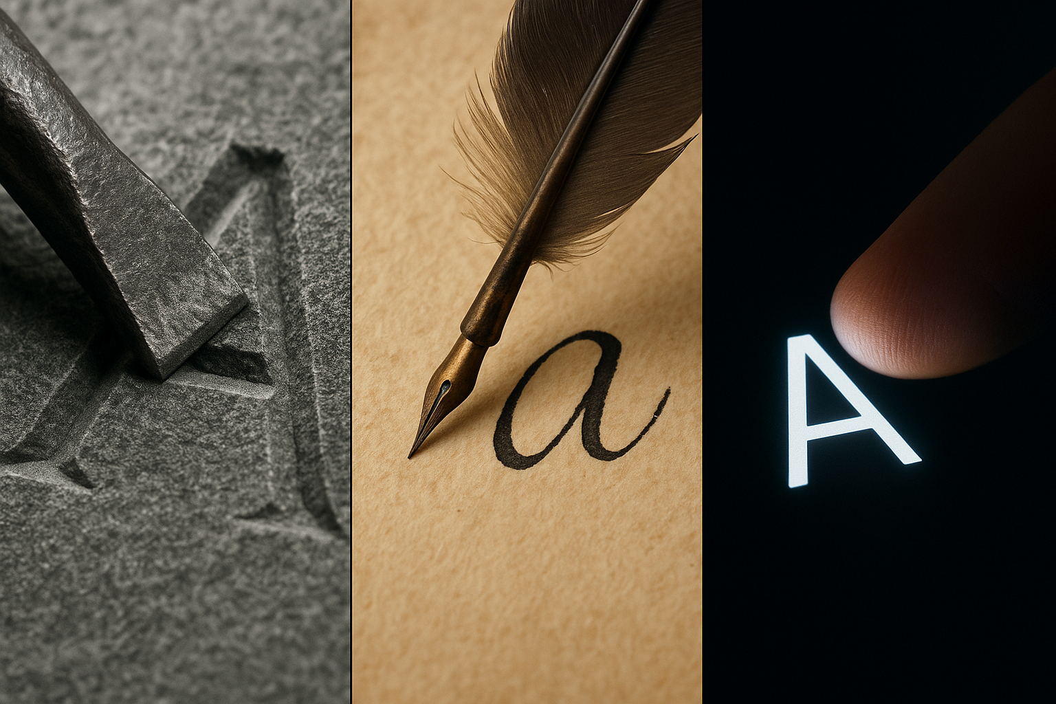
We see them every day, so familiar they’re practically invisible. The letters of our alphabet are the building blocks of our thoughts, our stories, and our societies. But have you ever stopped to ask a simple question: why do they look the way they do? Why is the Roman ‘O’ a perfect circle, while the letter ‘b’ has a stem and a bowl? The answer is a fascinating story not just of linguistics, but of engineering. Our alphabet was forged, quite literally, by the tools used to write it.
The shape of a letter is a fossil record of the physical interaction between a tool, a surface, and a human hand. To understand our ABCs, we must travel back in time and trade our keyboards for the chisels, reeds, and quills that gave them form.
The Wedge and the Clay: Cuneiform’s Imprint
Our story begins not with an alphabet, but with one of the earliest known writing systems: cuneiform. Developed by the Sumerians in ancient Mesopotamia over 5,000 years ago, cuneiform looks utterly alien to our modern eyes. It’s a complex system of abstract, wedge-shaped marks.
Why wedges? The answer lies in the medium. The Sumerians wrote on what they had in abundance: wet clay. Their tool was a stylus made from a reed, cut to have a sharp corner. Now, try to draw a smooth, curving line in soft clay. It’s a disaster. The clay drags, clumps, and creates a messy, imprecise furrow. The Sumerians discovered a far more efficient method: pressing. By simply pressing the corner of the reed stylus into the clay and lifting it, they could create a clean, quick, and repeatable mark—a perfect wedge. The Latin word for wedge is cuneus, hence “cuneiform.”
The entire visual language of cuneiform is a direct result of this physical limitation. It’s a system built from imprints, not strokes. The tool and the surface dictated that the most practical way to write was to combine these simple wedge shapes in different combinations and orientations. The hand wasn’t drawing a picture of a thing; it was performing a mechanical, almost data-entry-like task, stamping characters into a receptive surface.
The Chisel and the Stone: The Majesty of Roman Capitals
Let’s leap forward to the Roman Empire. The Romans gave us the foundation of our modern alphabet, and their letterforms were as monumental as their architecture. When we picture “Roman letters,” we think of the grand inscriptions on buildings like the Colosseum or on victory arches like the Trajan Column. These are Roman Square Capitals, and they are a masterclass in clarity, proportion, and permanence.
Their form was entirely dictated by their tools: a hammer and a chisel on stone.
- Straight Lines and Perfect Curves: Carving a straight line into stone is the most straightforward action. Complex, fiddly shapes are difficult and time-consuming. Therefore, the letters were based on strong, simple geometric forms: straight lines (I, L, T, F, E, H), circles (O), and semicircles (C, D, G).
- No Lowercase: Writing was a slow, deliberate act of carving. There was no need for a “quicker” version of letters. One majestic set of capital letters was sufficient for these permanent declarations.
- The Birth of Serifs: Ever noticed the little “feet” at the end of the strokes on letters in fonts like Times New Roman? Those are serifs, and they are a direct inheritance from Roman stone carvers. Finishing a chiseled stroke neatly is hard. The chisel can cause the stone to fracture or leave a messy endpoint. To solve this, carvers would begin the stroke with a short perpendicular tap of the chisel to create a clean entry point, and finish the stroke with another to square it off. This practical flourish, designed to prevent mistakes, evolved into an essential element of the letter’s design.
The chisel on stone produced a script that was powerful, deliberate, and designed to be read from a distance. Its purpose was public and eternal, and its shape reflects that.
The Quill and the Parchment: The Flow of Ink Creates Lowercase
So if Roman letters were all capitals, where did our lowercase letters come from? For that, we need to switch tools and surfaces again. As the Roman Empire waned, writing moved from public monuments to monastic scriptoriums. Stone and chisels were replaced by papyrus and, later, parchment (treated animal skin). The tool of choice became the reed pen and eventually the bird-feather quill.
This was a revolutionary shift. For the first time, writing was about the flow of ink.
A scribe writing with a broad-nibbed quill on smooth parchment could write much faster than a stone carver. Speed and efficiency became paramount, especially as demand for books and documents grew. This need for speed fundamentally changed the shape of letters. Scribes began to simplify and round the stately Roman capitals. An ‘E’ became an ‘e’ with a single looping stroke; the straight lines of ‘A’ curved into ‘a’.
The great breakthrough came during the reign of Charlemagne around 800 AD. To standardize writing across his empire, he promoted a new script: Carolingian Minuscule. This beautiful and highly legible script is the direct ancestor of our modern lowercase alphabet. Its key features were a direct result of the quill pen:
- Ascenders and Descenders: The natural, fluid motion of the hand and wrist made it easy to create strokes that went above the main line (like in ‘b’, ‘d’, ‘h’) and below it (like in ‘g’, ‘p’, ‘q’). These ascenders and descenders made words more visually distinct and easier to read quickly.
- Joining Strokes and Cursive: As scribes sought ever-greater speed, they began to lift the pen as little as possible, leading to letters flowing into one another. This was the birth of cursive script—something impossible with a chisel and unthinkable in wet clay.
The quill didn’t just copy old letters; its physical properties—flexibility, the ability to hold ink, the way it responded to pressure—actively invented new forms perfectly suited for its use.
From the Stylus to the Screen
This principle has followed writing through every technological leap. The printing press with its metal type fossilized the letterforms created by scribes. The ballpoint pen, which produces a monoline (a line of uniform thickness), subtly flattened our handwriting, removing the thick-and-thin variance of the quill. The keyboard divorced the physical act of writing from the form of the letter entirely; we press an identical key to summon a ‘w’ or an ‘i’.
Today, we find ourselves in a fascinating new era. With styluses on touchscreens, we are, in a sense, returning to the direct creation of letters with a tool in hand. These digital tools can mimic the pressure sensitivity of a quill or the texture of a crayon, paradoxically using hyper-advanced technology to rediscover the physical craft of our ancestors.
So the next time you write a note or type an email, take a moment to look at the letters. See the ghost of the chisel in the stark lines of a ‘T’. See the fluid, looping path of the monk’s quill in the bowl of a ‘g’. You’re not just using an alphabet; you’re holding a museum of technology in your hands, where every curve and line tells a story of the tool that made it.


