A Scribble in Ancient Rome: The Birth of a Symbol
We see it every day, tucked between company names, standing in for “and” in movie titles, and adding a touch of elegance to wedding invitations. The ampersand (&) is so common that we barely notice it. But this graceful, looping character is no mere punctuation mark; it’s a linguistic fossil, a piece of living history that connects our digital age directly to the bustling streets of ancient Rome.
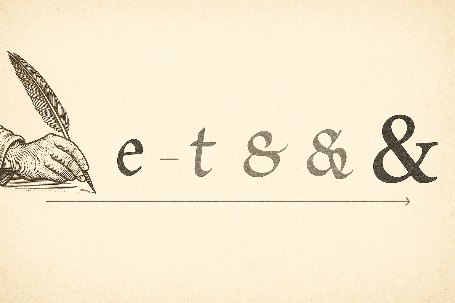
Our story begins nearly two thousand years ago. Roman scribes, tasked with copying vast amounts of text by hand onto papyrus or wax tablets, were always looking for ways to work more efficiently. Just as we create shortcuts and abbreviations in our own notes, they developed their own system of shorthand. One of the most common words they had to write was the Latin word for “and”: et.
Over time, in a natural evolution of handwriting, scribes began to slur the two letters together. The left-hand curve of the ‘e’ would flow directly into the vertical stroke of the ‘t’. This combination of two or more letters into a single character is known as a ligature. If you look closely at many modern ampersands, you can still see the ghost of its parent letters. The looped, often circular part is the ‘e’, and the upward, sometimes crossed, tail is the ‘t’.
This humble time-saving scribble was the first version of the ampersand. It wasn’t a formal character yet, but a practical tool born from the necessity of speed, a precursor to the typographic beauty it would one day become.
And Per Se, And: The Alphabet’s 27th Letter
As the Roman Empire faded and its script evolved into the Carolingian minuscule used throughout medieval Europe, the ‘et’ ligature persisted. It was so common and so useful that it was adopted by early printers centuries later. But its most peculiar chapter was yet to come: its brief but official tenure as a member of the English alphabet.
By the 19th century, the ‘&’ was so universally recognized as representing the word “and” that it was commonly taught as the 27th and final letter of the alphabet. Schoolchildren reciting their ABCs would finish with “…X, Y, Z, and &.”
This is where the character gets its strange and wonderful name. When reciting the alphabet, any letter that could also be used as a word on its own (like ‘A’ or ‘I’) was preceded by the Latin phrase per se, meaning “by itself.” This was done to avoid confusion. A student would say, “A per se A,” (meaning “A by itself is the letter A”), “…I per se I,” and so on.
Following this logic, when they reached the end of the alphabet, they would finish by saying, “…X, Y, Z, and per se and.” The final symbol, ‘&’, stood for the word “and,” so it was identified as “and, by itself, and.”
Say that phrase—”and per se and”—quickly and repeatedly. Over years of slurred recitation by countless children, the phrase contracted and smoothed out, morphing into the single word we use today: ampersand.
A Typographer’s Darling
The ampersand was eventually dropped from the alphabet, but its story was far from over. As typography became a refined art form, the ampersand blossomed. Freed from the constraints of being just a letter, it became a playground for designers.
Unlike almost any other character, the ampersand has no single, rigid form. Its design can vary wildly from one typeface to another.
- In traditional serif fonts like Garamond or Caslon, it often retains a clear ‘et’ structure, appearing classical and intricate.
- In modern sans-serif fonts like Helvetica, it can be simplified into a more abstract, streamlined symbol.
- Italic ampersands are famously flamboyant, offering designers a chance to add a flourish of personality to their text. Some are so elaborate they are works of art in their own right.
This stylistic freedom has made it a favorite in branding and graphic design. An ampersand suggests a partnership that is more established, elegant, and intertwined than a simple “and” ever could. Think of iconic logos and brand names:
- Tiffany & Co.
- Barnes & Noble
- Johnson & Johnson
- Dolce & Gabbana
In these contexts, the ampersand does more than just connect two words; it visually represents a union, a bond of history and quality. It elevates the name, making it feel more permanent and sophisticated.
From Papyrus to Pixels: The Modern Ampersand
Today, the ampersand is more ubiquitous than ever, having found new life in the digital world. Its journey has come full circle. The Roman scribe’s need for speed is mirrored in our own fast-paced digital communication. The ampersand is a single character, saving us two keystrokes—a tiny efficiency, but one that feels natural in texts and on social media.
It also plays a crucial, though often invisible, role in the backbone of the internet. In computer programming and web addresses (URLs), the ampersand is a functional character used to separate parameters. In HTML, it’s used to define character entities, like © for the copyright symbol or, amusingly, & for the ampersand symbol itself.
So the next time your finger types that familiar ‘&’, take a moment to appreciate the journey it has taken. This single character is a direct link to a Roman scribe saving a moment’s effort. It’s a remnant of a time when schoolchildren recited 27 letters. It is a symbol of both connection and efficiency, a testament to how language evolves, adapts, and carries its history with it.
The ampersand is not just a substitute for “and.” It is a story—of language, design, and culture—all coiled into one elegant, timeless symbol.